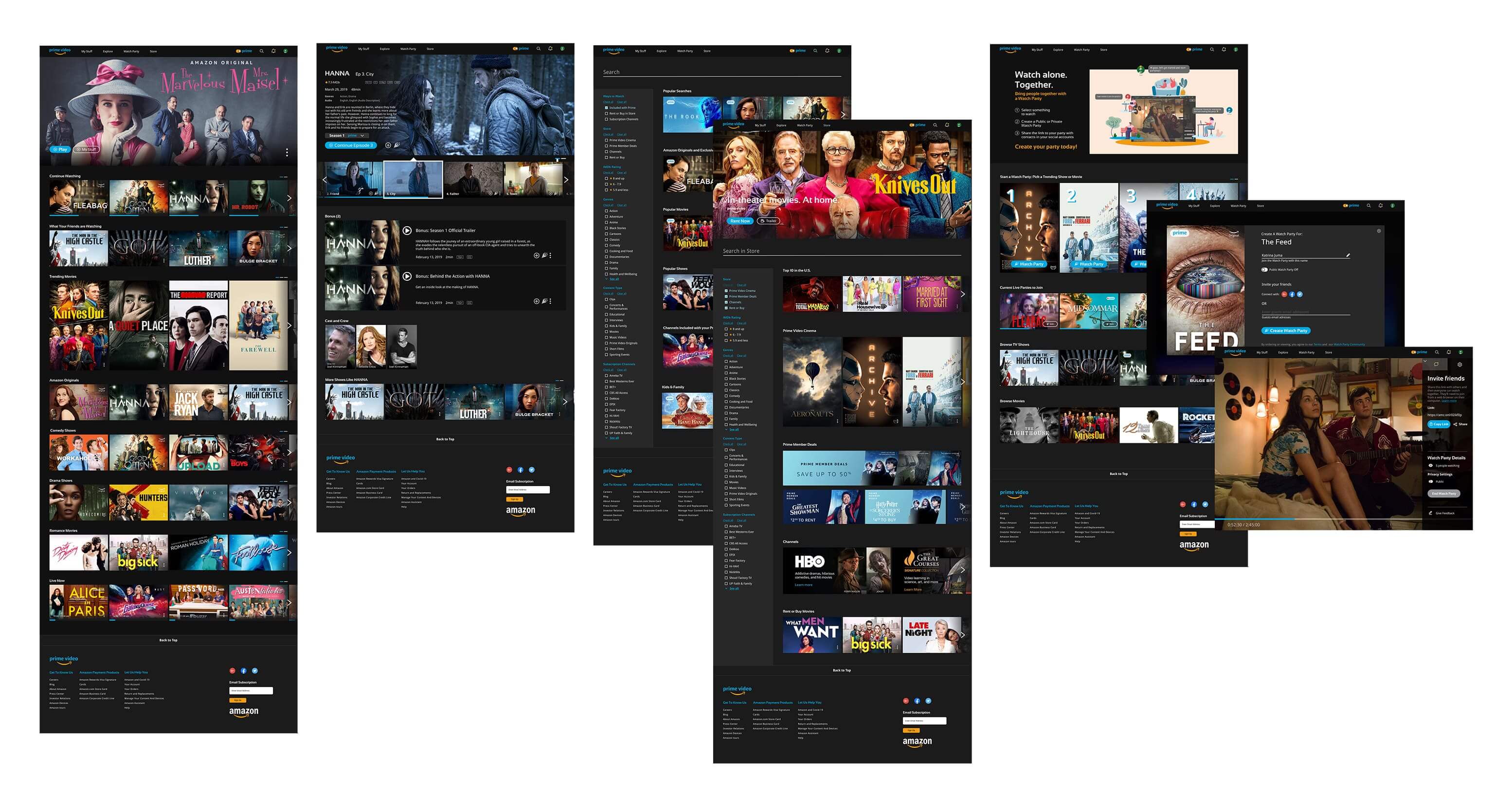
Prime Video - Redesign


A redesign of the Prime Video platform to create a better viewing experience - by shifting focus to the individual user and connecting their viewing choices with their social groups. Design decisions driven by meetings with Amazon UX lead.
My Role:
Lead user research and interviews, conducted case study of Amazon Prime’s existing UI guide, collaborated on prototyping and user testing.
Skills:
Project Management, UX Research, Competitor Analysis., Wire Frames, Hi-Fi Mocks, Prototyping
Project Team

Adriana, Deepa 🙋‍♀️ , Hattie, Sonja, Lydia

Project Duration
4 weeks

Final Prototype


safari interface border


The Challenge

We conducted a survey among 100 users, 70% preferred other streaming platforms and just 30% preferred Amazon Prime Video. Our goal was to identify user's key pain points with Prime Video, and redesign the interface to minimize friction.

Users feel that when they are in the Prime Video portal, they feel like they are using a generic and nondescript account. It does not allow for social sharing of user's movies & shows which prevents interaction between friends on the site.


Research
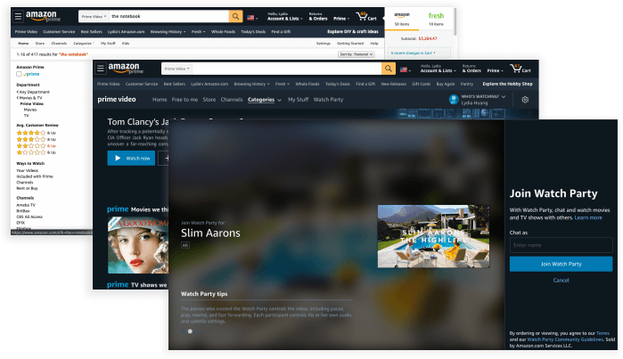
Current Website
Current Website not providing a streamlined experience

Prime Video was developed as an added bonus of having Prime rather than a streaming service in its own right. It is not optimized for streaming, but rather for e-commerce. We saw an opportunity here to redesigned the website for a better, more personable experience.

Prime Video was developed as an added bonus of having Prime rather than a streaming service in its own right. We saw an opportunity here to redesigned the website for a better, more personable experience.
Current Website
Users looking for personalized content, social connectivity

To test our assumption, we performed 5 interviews with a demographic of active Prime Video users aged 22–38, who have an active Amazon Prime subscription.

To test our assumption, we performed 5 interviews with a demographic of active Prime Video users aged 22–38, who have an active Amazon Prime subscription.

Main Findings:
  • The Prime Video site lives within the larger Amazon Prime marketplace, which results in several usability issues
  • Prime Video is error-prone when users are trying to find free content only
  • Lack of consistency in the terminology used on cards and navigation
  • Accelerators aimed to offer users flexibility and efficiency of use are not existent or not optimized for a video streaming service


Definition & Synthesis
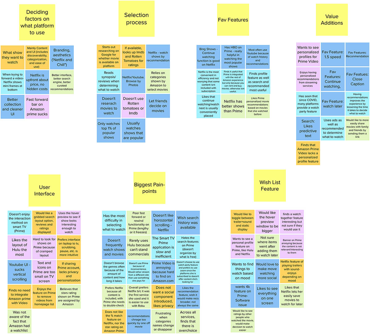
amazon prime video affinity diagram
Sorted user interview insights into multiple categories, which helped us identify common trends and confirm main pain points
amazon prime video affinity diagram
  • Prime Video’s poor and cramped UI prevents users from using the platform more often
  • Users value ratings and friend’s recommendations when deciding what to watch
  • Features like profiles, continue watching, and recommendations based on watching history are valued by users
  • Existing browse and search features lead to irrelevant results and cause user frustration
75% of users preferred competitors over Prime Video

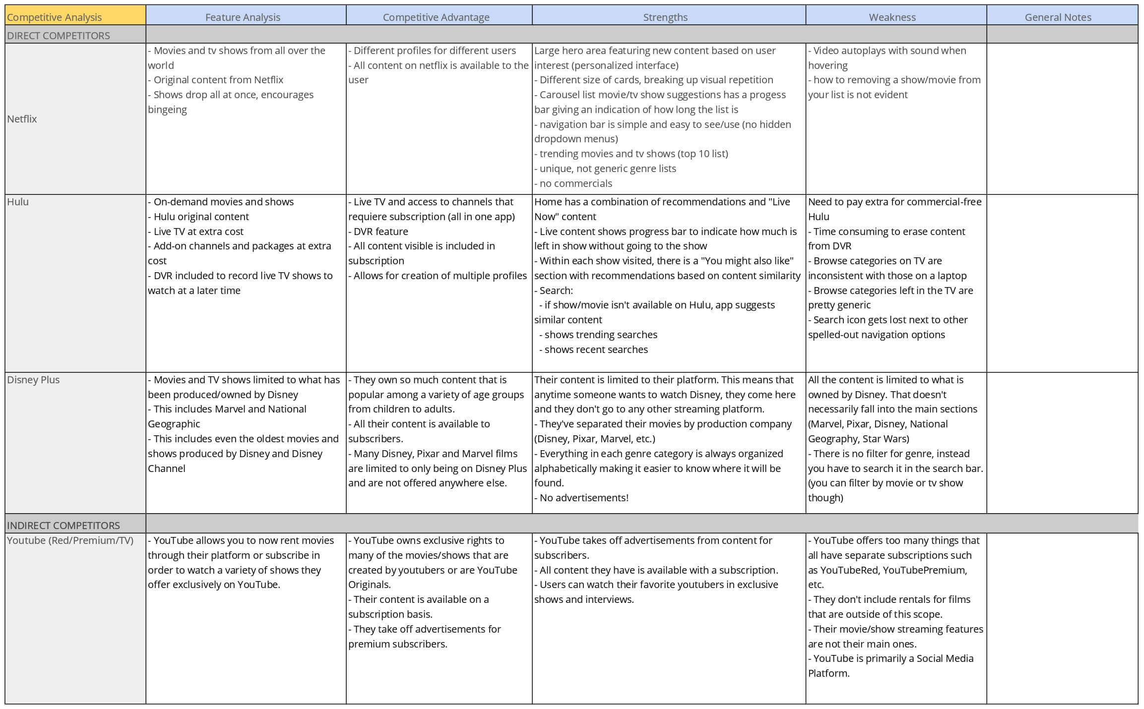
To ideate solutions that would help the user achieve her goals, we performed a competitive analysis to figure out if/how other products were addressing the user needs. We evaluated 3 direct competitors (Hulu, Netflix and Disney+) and 1 indirect competitor (YouTube)

Competitor's Strengths
  • Welcoming homepage with personalized suggestions and profiles
  • Carousels with visual rhythm
  • Progress bars for live content
  • Objective content recommendations based on users' watch history
  • Display of trending searches and popular content
  • Use of alphabetical order to categorize genres
Competitor's weaknesses
  • By default, the sound is turned on when trailers autoplay
  • Need to pay extra to avoid advertisement
  • Lack of progress indicator on horizontal carousel scrolling
  • Lack of connectivity to social accounts (except YouTube)
  • Not all of them offer access to content that is not included with membership


User Persona, Journey Map & Storyboard
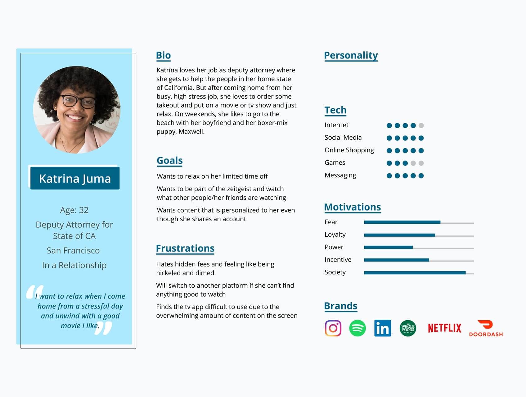
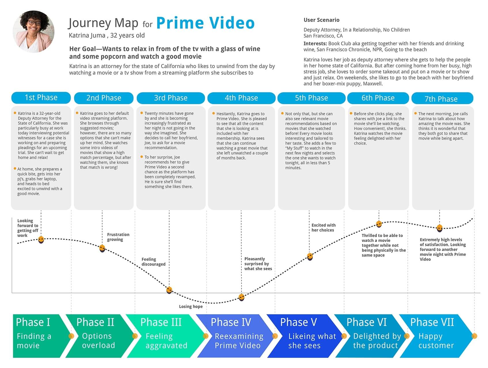
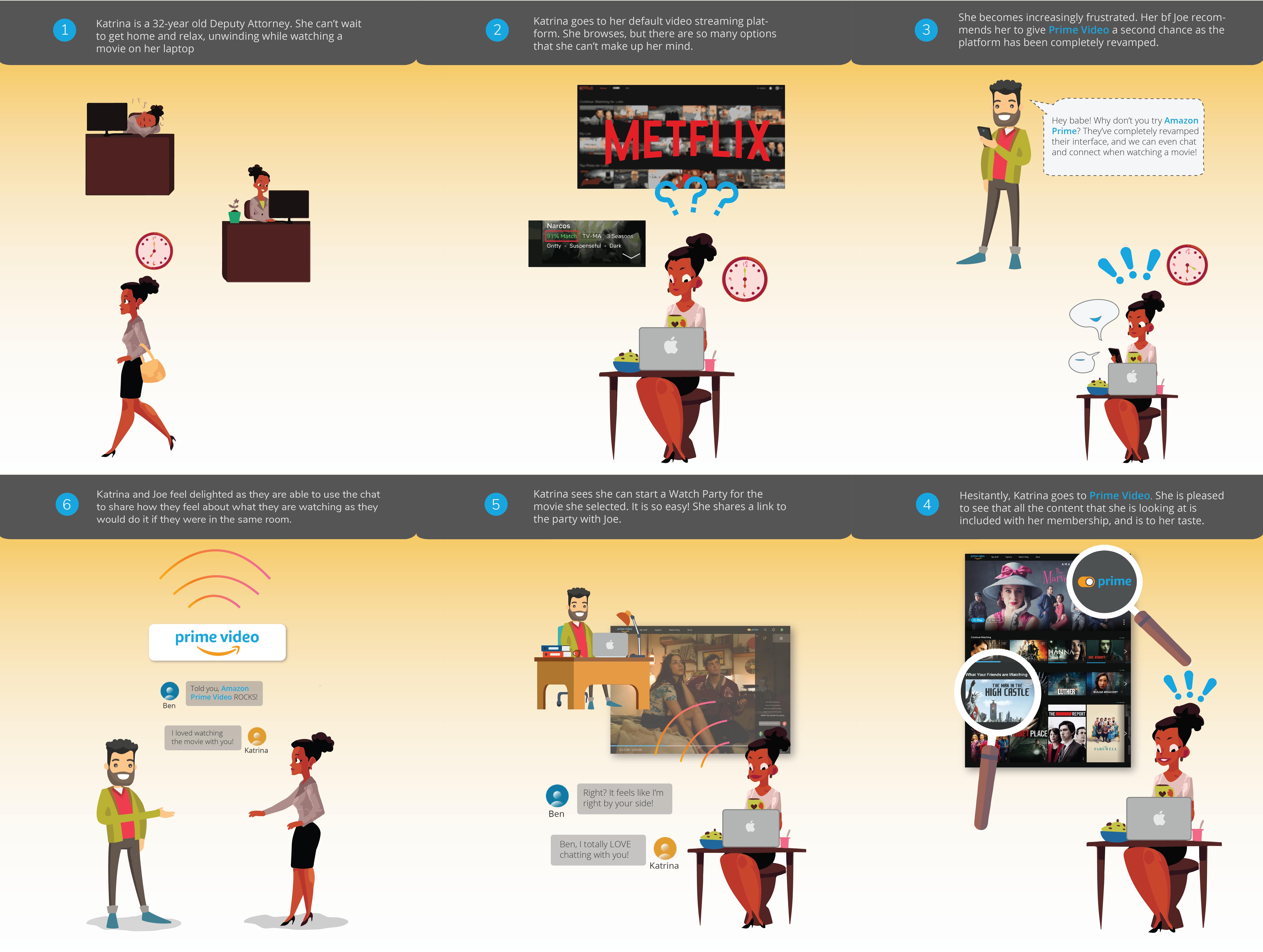
​ With a better understanding of the behavioral and cognitive processes of potential users, we created a User Persona, and also put together a storyboard to showcase our value proposition.


left_arrow
right_arrow

quotes
How might we help users feel familiar with Prime Video as well as delighted to use the platform so Prime Video becomes their default video streaming platform?


Redesign Goals
Based on the above, our team defined these project redesign goals:
  1. Detach Prime Video from broad Amazon Prime Marketplace for a clean and consistent UI and streamlined user experience
  2. Allow integration of social accounts to Prime Video and improve the Watch Party experience to help users connect with each other
  3. Add personalization with profiles, relevant suggested content, and suggested content from social media contacts
  4. Give users an easy mechanism to distinguish free from paid content (store and subscription channels)
  5. Create a dedicated Prime video searching feature that integrates with the store to guarantee that users find what they need
  6. Replace Amazon marketplace movie ratings with Imdb rating to which Amazon has the rights to


Ideation
Identify key usability issues with Prime Video
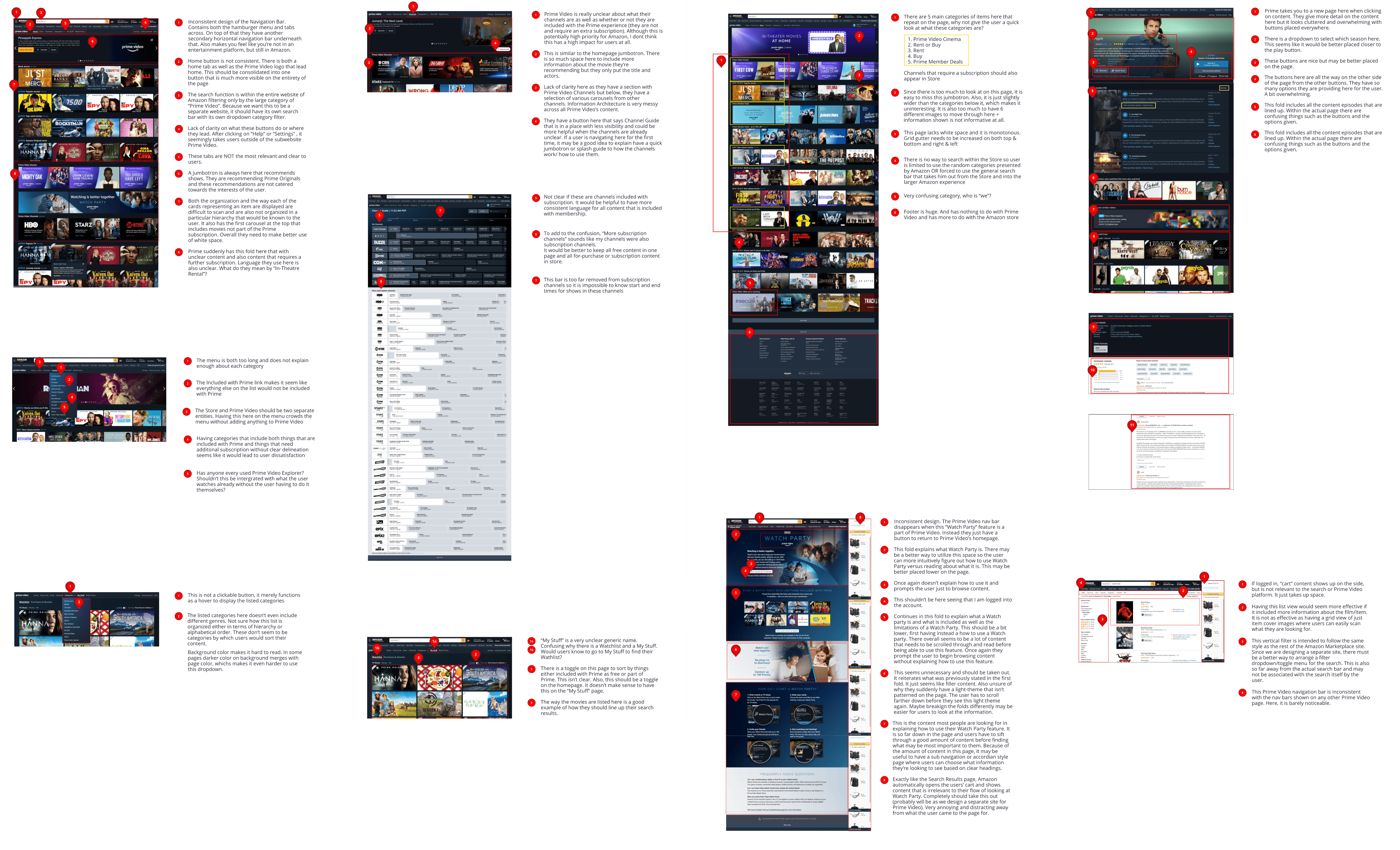
We conducted a page-by-page analysis of Prime Video’s UI to identify specific usability issues. We focused on the main pages that users would use most frequently including homepage, show/movie detail page, search, and store. In addition, we analyzed the Watch Party page which was a major desirable component according to user interviews.
amazon prime video heuristican alysis

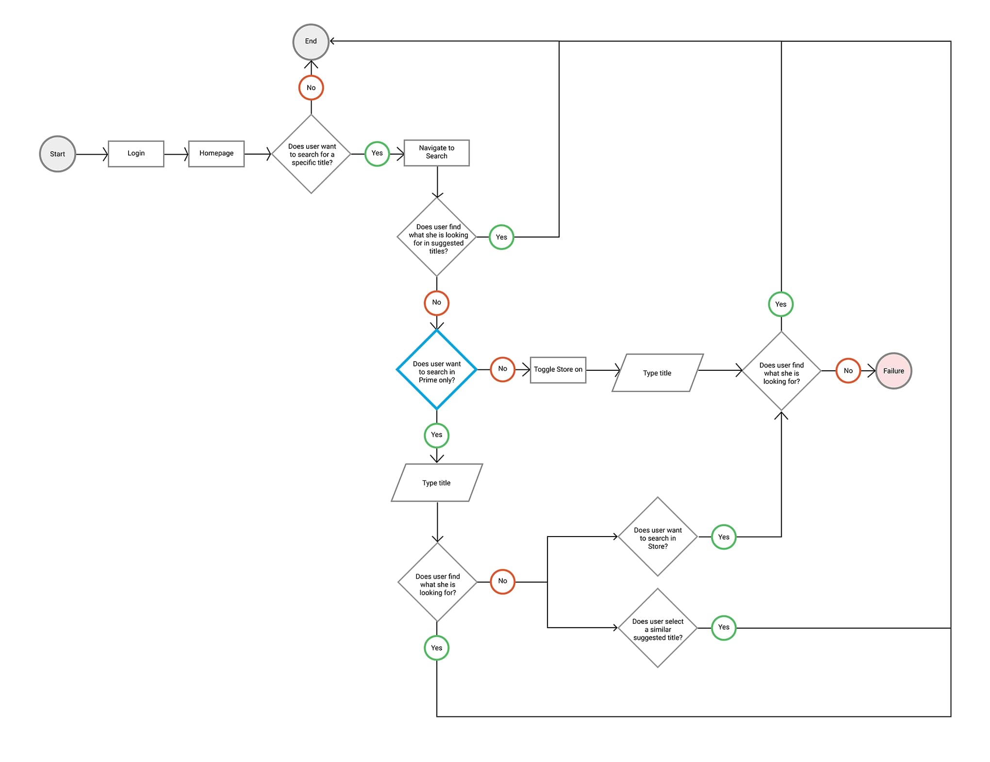
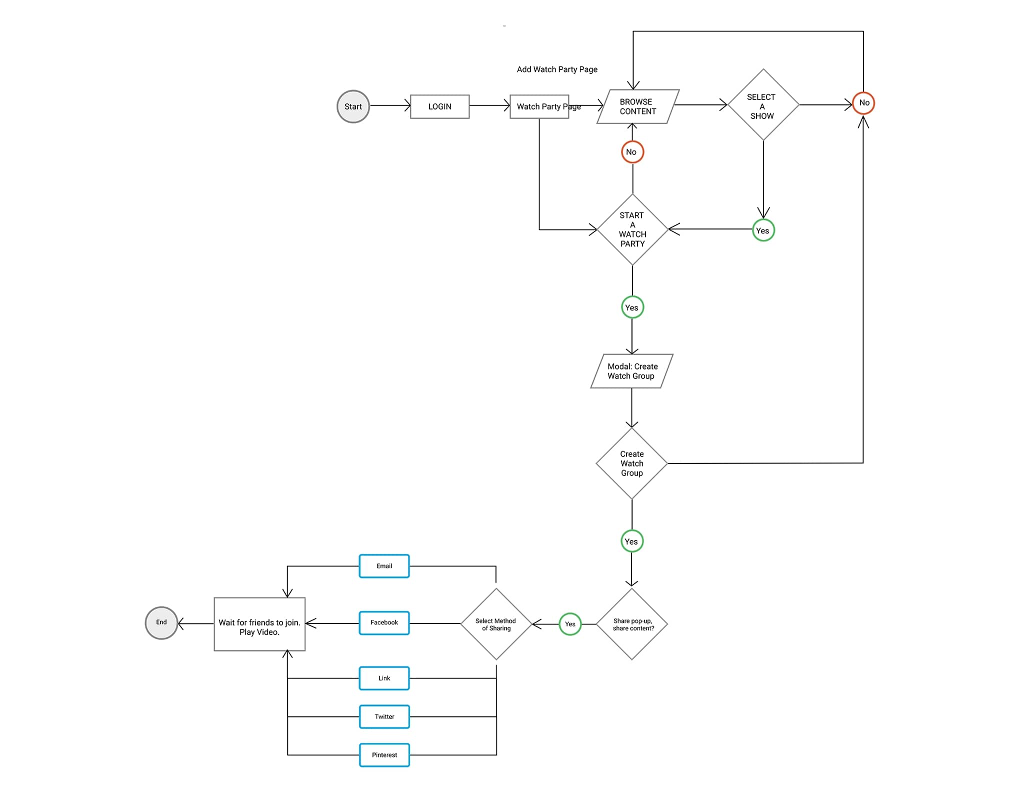
Identify critical pain points by mapping user flows
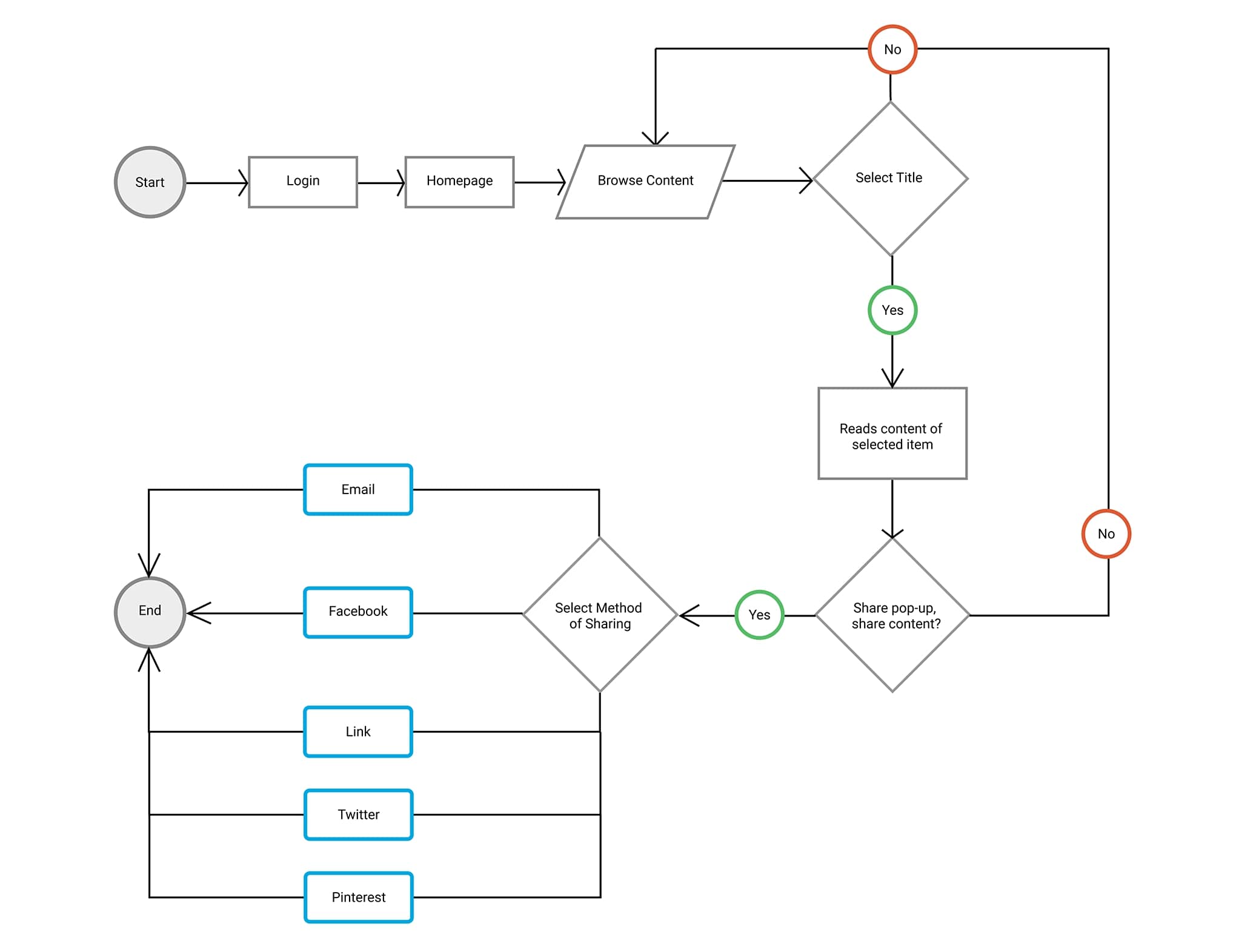
Given our ambitious goals, we created several users flows to visualize the following processes:
  • Login and connect to social accounts
  • Browse content on homepage
  • Search content
  • Explore the Store
  • Create and start a Watch Party
left_arrow
right_arrow


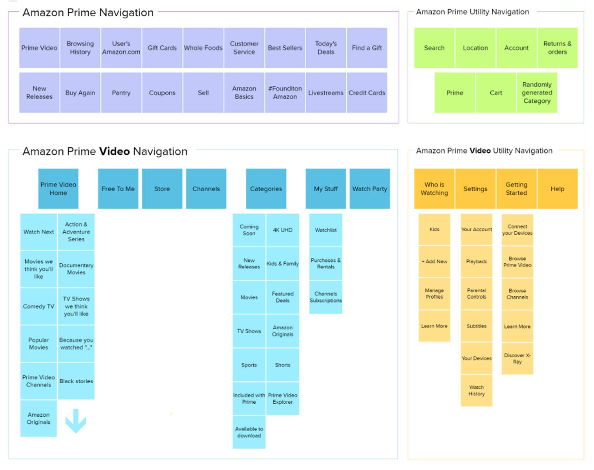
Restructure the Prime Video Homepage Information Architecture

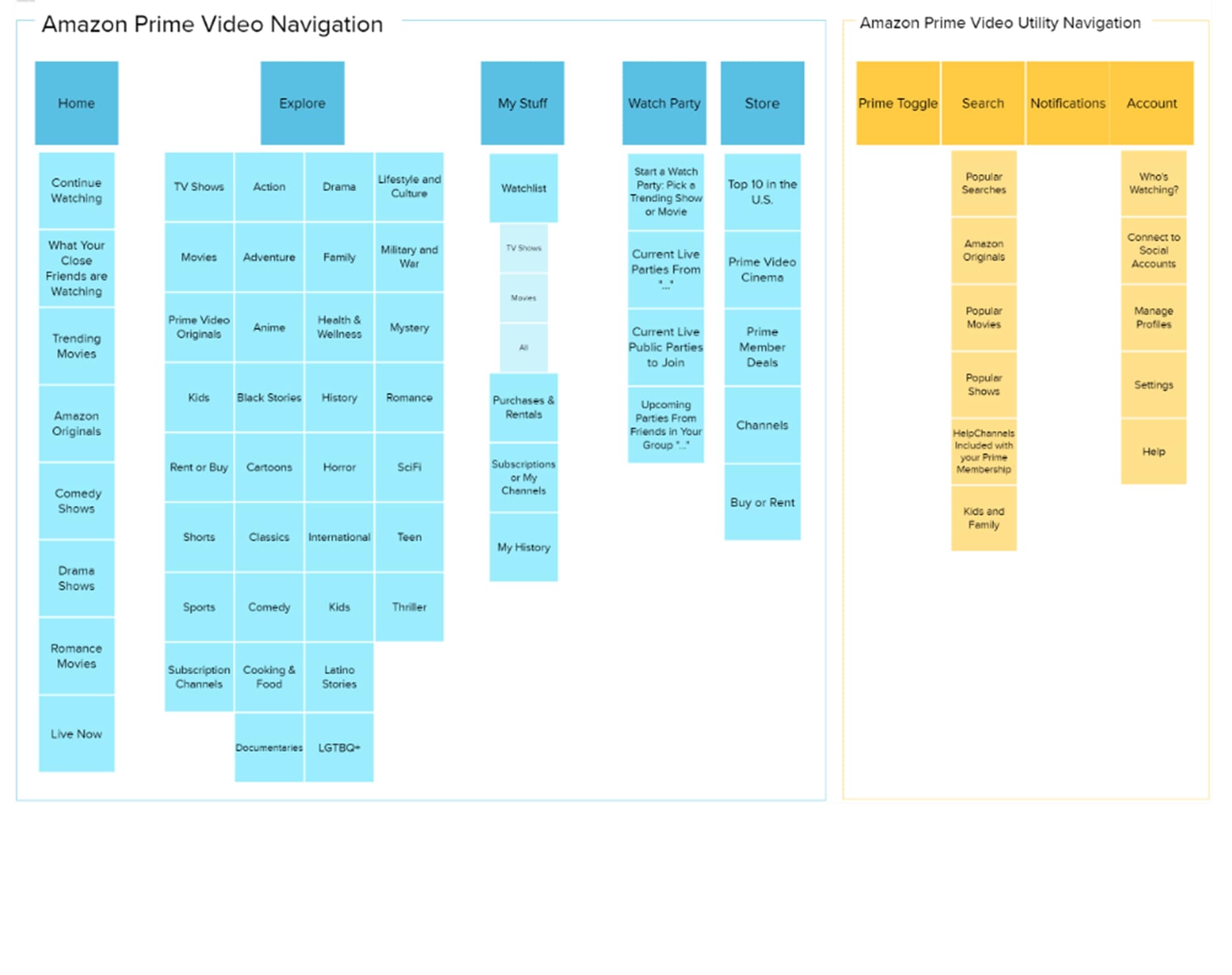
Since one of the site’s main usability issues was the display of irrelevant information, we decided to conduct a card sorting exercise to redefine the site’s information architecture.

left_arrow
right_arrow


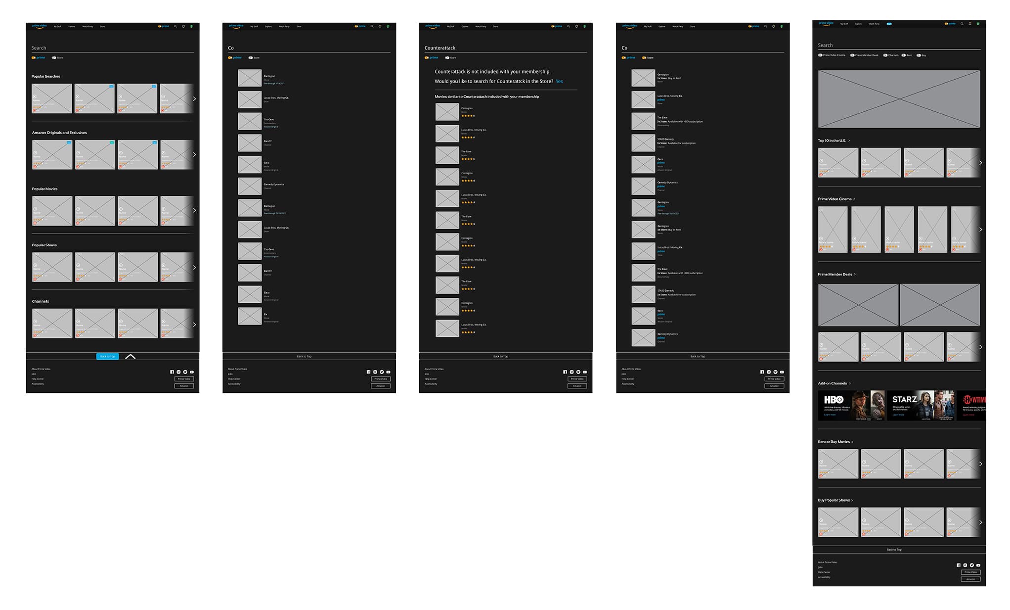
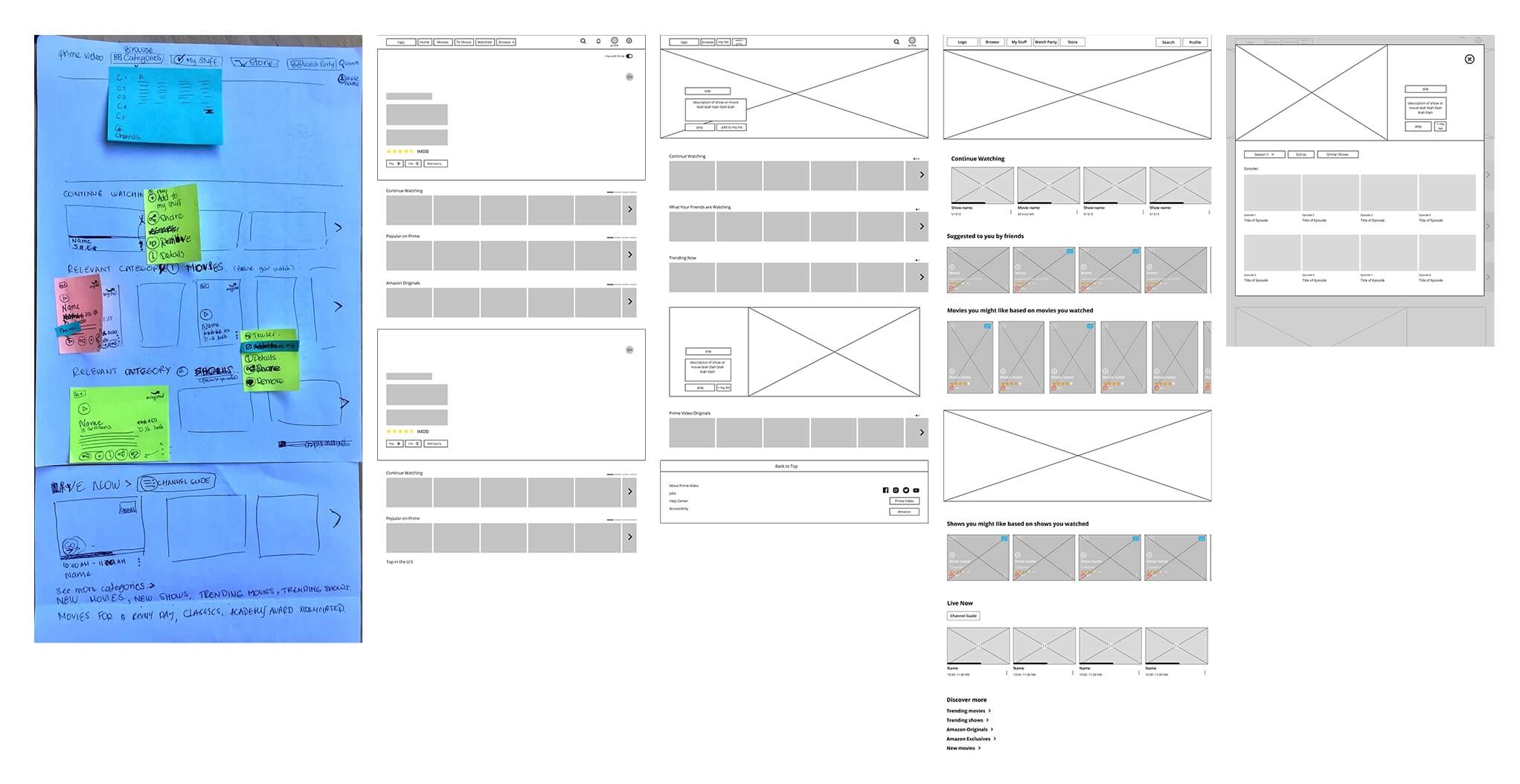
Developed lo-fidelity wireframes to lay out user preferred content
amazon prime video lofi
We sketched a homepage to ideate this page's information architecture and rhythm. Likewise, this sketch above served to conceive iconography and interactions
amazon prime video search store
Focused on restructuring layouts of key pages
  • Create layout consistency across pages with a similar purpose
  • Figure out what information to display on the show/movie cards
  • Redesigning the grid by introducing vertical elements and full span hero images to break up the monotonous grid arrangement

We collaborated effectively over Zoom during the various design stages, especially when developing mid-fi prototypes and developing the atomic components that went into building the redesigned website.
amazon prime video teamwork


Lead UI redesign objectives using Amazon's existing style guide

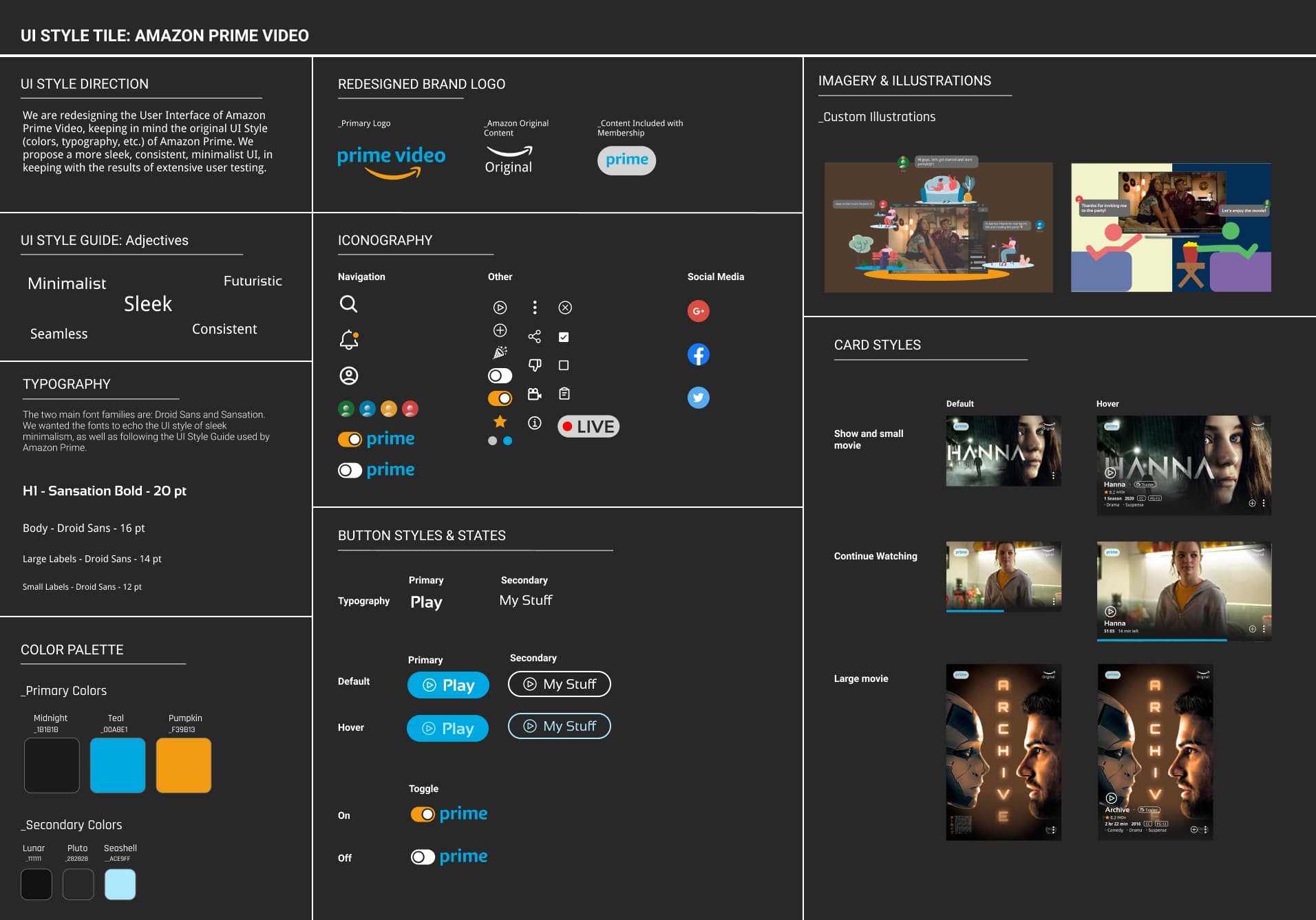
I lead the process of redefining our UI redesign adjectives and visual style, which I then consolidated on a style tile. I made sure to reference Amazon Prime’s UI Style Guide, so as to not deviate/ make the user feel disoriented while navigating the redesigned Prime Video website

amazon prime video styletile


Created a UI Component Library which secured uniformity & facilitated page assembly
  • Create atom elements: Define text and color Figma styles, Select and convert icons into components
  • Create simple to more complex nested components
  • Consistently name components to exchange instances on the property panel efficiently
amazon prime video ui


Usability Testing
& Iteration
amazon prime video usability testing
Identify main user flows & performed testing
  • Log in and connect to Facebook
  • Browse the hompage and use Prime Toggle
  • Search for a specific movie
  • Create a WatchParty and chat with friends
amazon prime video usability testing
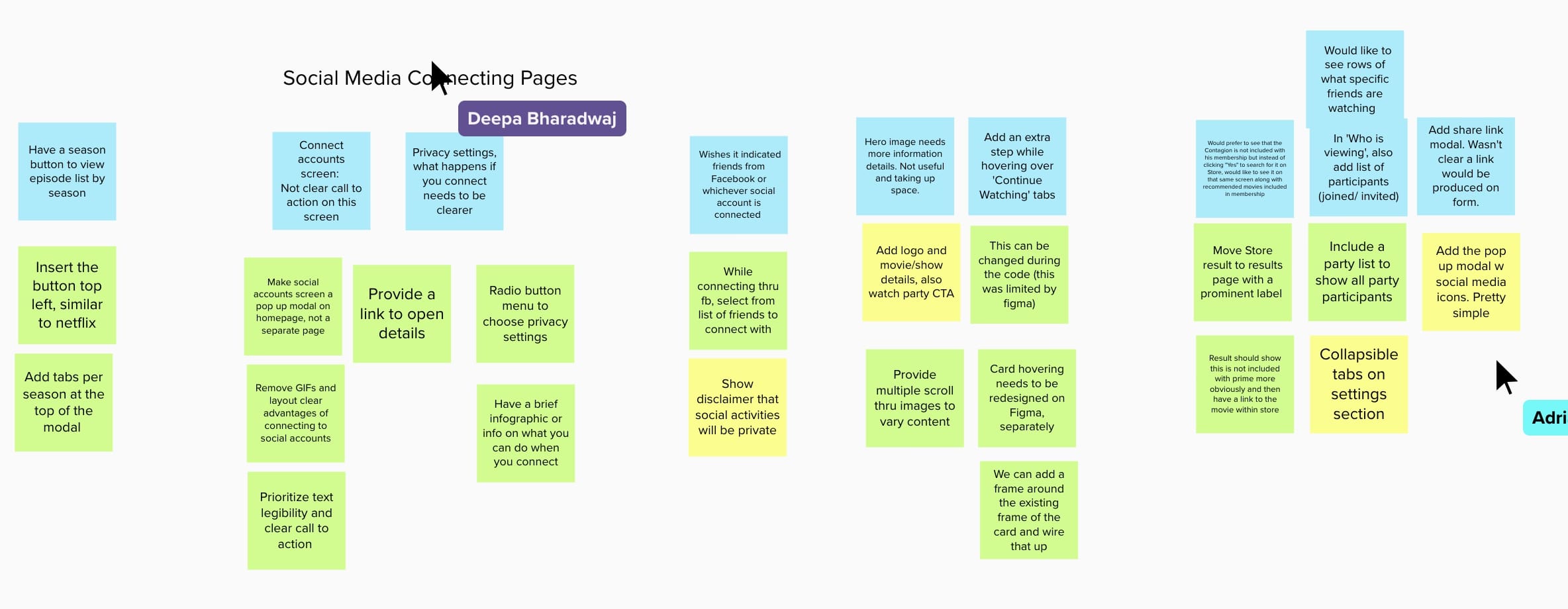
Analyze user testing results to develop key insights for potential redesign issues
Through our testing, we found that users generally skipped through the onboarding procedure detailing the purpose of connecting their social media account with their Prime Video account without reading it through completely.

The wording and form design on the Watch Party screens were also confusing to users.
Through our testing, we found that users generally skipped through the onboarding procedure without reading it through completely.

The wording and form design on the Watch Party screens were confusing to users with many not understanding what having a Watch Party would entailed.
Improvements
  • Simplify the onboarding screens while still informing users of the benefits of connecting their social media accounts
  • Clarify the concept of a Watch Party with better wording and better form design.


Redesign Comparison
amazon prime video home page
Page by Page Comparison
amazon prime video home page
Homepage Redesign
Homepage Redesign
We separated Prime Video from the shopping site, thus simplifying the navigation bar to only include what is necessary for streaming. You can also see a continuous theme of a lack of cost transparency throughout the original Prime Video site which lead to a great deal of user frustration , we created a Prime toggle where users can turn on the toggle to only see content that is included with Prime.
We separated Prime Video from the shopping site, thus simplifying the navigation bar to only include what is necessary for streaming. Since there was a continuous theme of a lack of cost transparency throughout the original Prime Video site which lead to a great deal of user frustration , we created a Prime toggle where users can turn on the toggle to only see content that is included with Prime.
amazon prime video cards
Cards Redesign
For the cards, we redesigned the Prime content tag from a banner to a more pleasing geometric oval shape. The original hover card would not play the content unless you clicked specifically on the play button. The redesign has the card itself as the “play button.” We created an "info icon" as well as a button to play trailers so users can find out more information easily.
Cards Redesign
For the cards, we redesigned the Prime content tag from a banner to a more pleasing geometric oval shape. The original hover card would not play the content unless you clicked specifically on the play button. If you clicked on the image, it would open to another page with the full description of the content. The redesign has the card itself as the “play button.” Clicking on the “info” icon brings up a pop-up modal that describes the content. We also created a button to play trailers so users can find out more information easily.
amazon prime video details
Details Modal
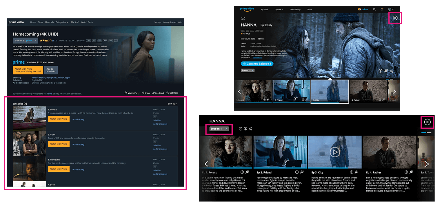
Details Modal
The original details modal is a page by itself that lead the customer away from the homepage. We eliminated this additional friction in usability by using a expanding modal instead, which allows the details modal to be shown on the same page as the other content. The additional episodes of a show are now shown with a horizontal scroll instead of a vertical one which also cuts down on the amount of up and down scrolling and keeps the user at the top of the page near the main content.
The original details modal is a page by itself that lead the customer away from the homepage. We eliminated this additional friction in usability by using a expanding modal instead. The additional episodes of a show are now shown with a horizontal scroll instead of a vertical one which also cuts down on the amount of up and down scrolling and keeps the user at the top of the page near the main content.
amazon prime video watch party
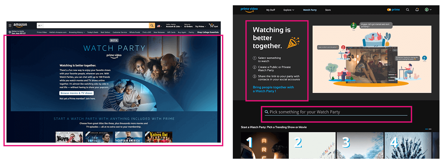
Watch Party
The original Watch Party landing page is one full page of instructions and text, which drags on a user’s attention span and cognitive load. We created an intuitive and simple instruction process for the Watchparty feature. We also created a search bar directly on the Watch Party page so finding something for your Party feels inclusive to that feature.
Watch Party
The original Watch Party landing page is one full page of instructions and text., which drags on a user’s attention span and cognitive load. We edited the instructions of setting up a Watch Party to three short bullet points and designed it so that creating one is intuitive and simple. We also created a search bar directly on the Watch Party page so finding something for your Party feels inclusive to that feature.
amazon prime video footer
Footer
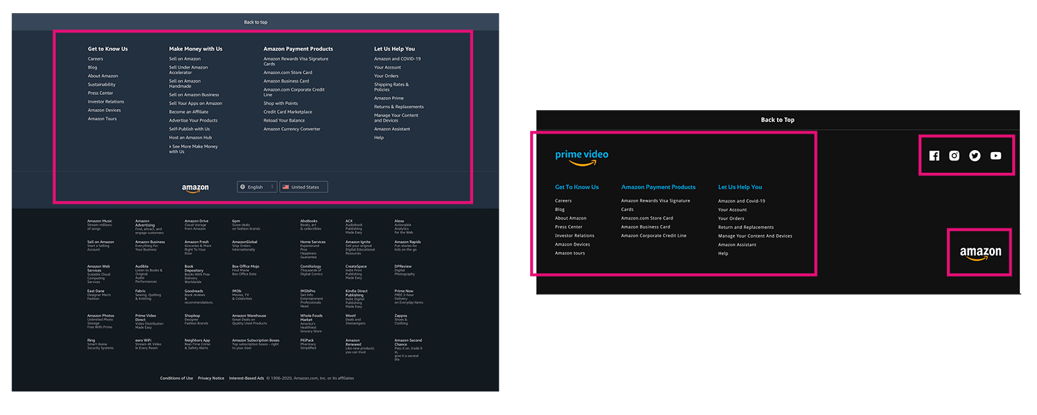
Footer
The original footer included all of Amazon’s subdivisions, from Prime Video to the Amazon Fresh to selling on Amazon. This created a unwieldy and bloated footer that was not helpful at all for finding information specific to Prime Video. We simplified the footer to only reflect what was important to the streaming platform itself.
The original footer included all of Amazon’s subdivisions, from Prime Video to the Amazon Fresh to selling on Amazon.We simplified the footer to only reflect what was important to the streaming platform itself.


High Fidelity Design
Fixed minor UI and visual design issues discovered through usability testing
amazon prime video hifi
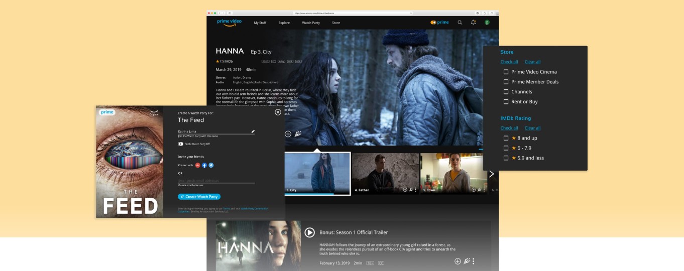
We ideated a better way to convey the value of integrating Prime Video with social accounts since this was such a critical piece of our value proposition.


amazon prime video desktop mockup option


Results
final thoughts
  • Improved perception of Prime Video among users
    We tested our hi-fi prototype on 10 users, 90% of users preferred the redesigned interface.
  • Integration of Filters
    We had a 100% success rate with the redesigned prime toggle feature. Further explore the integration of filters directly on the homepage to further personalize users’ experience and suggest content based specific needs (i.e. language, subtitles, content duration, and rating/advisory).
  • Reinforce Social Media component
    Continue to explore ways to leverage Prime Video’s integration to social accounts while protecting users privacy and giving them total control over what they share and whom they share it with.