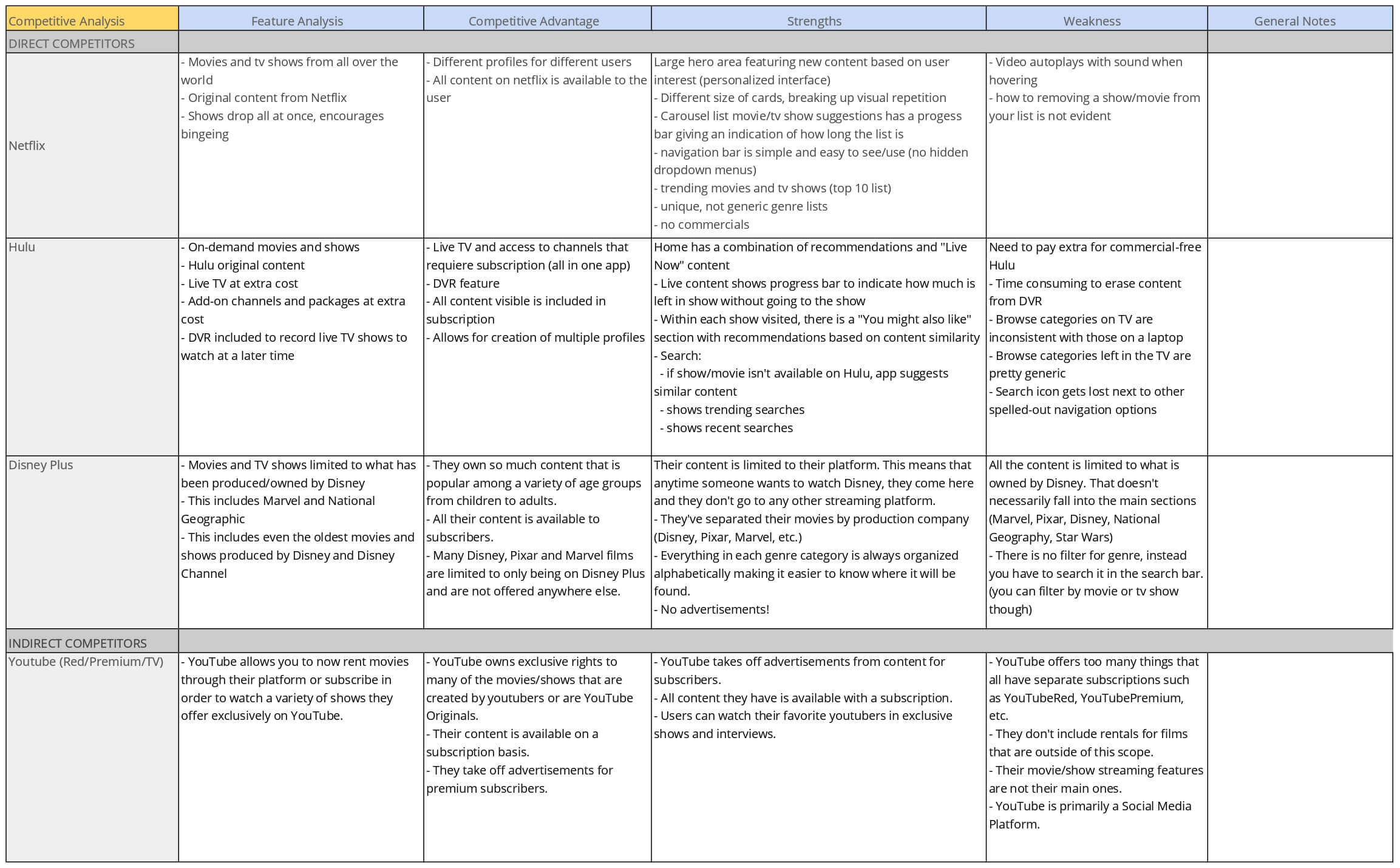
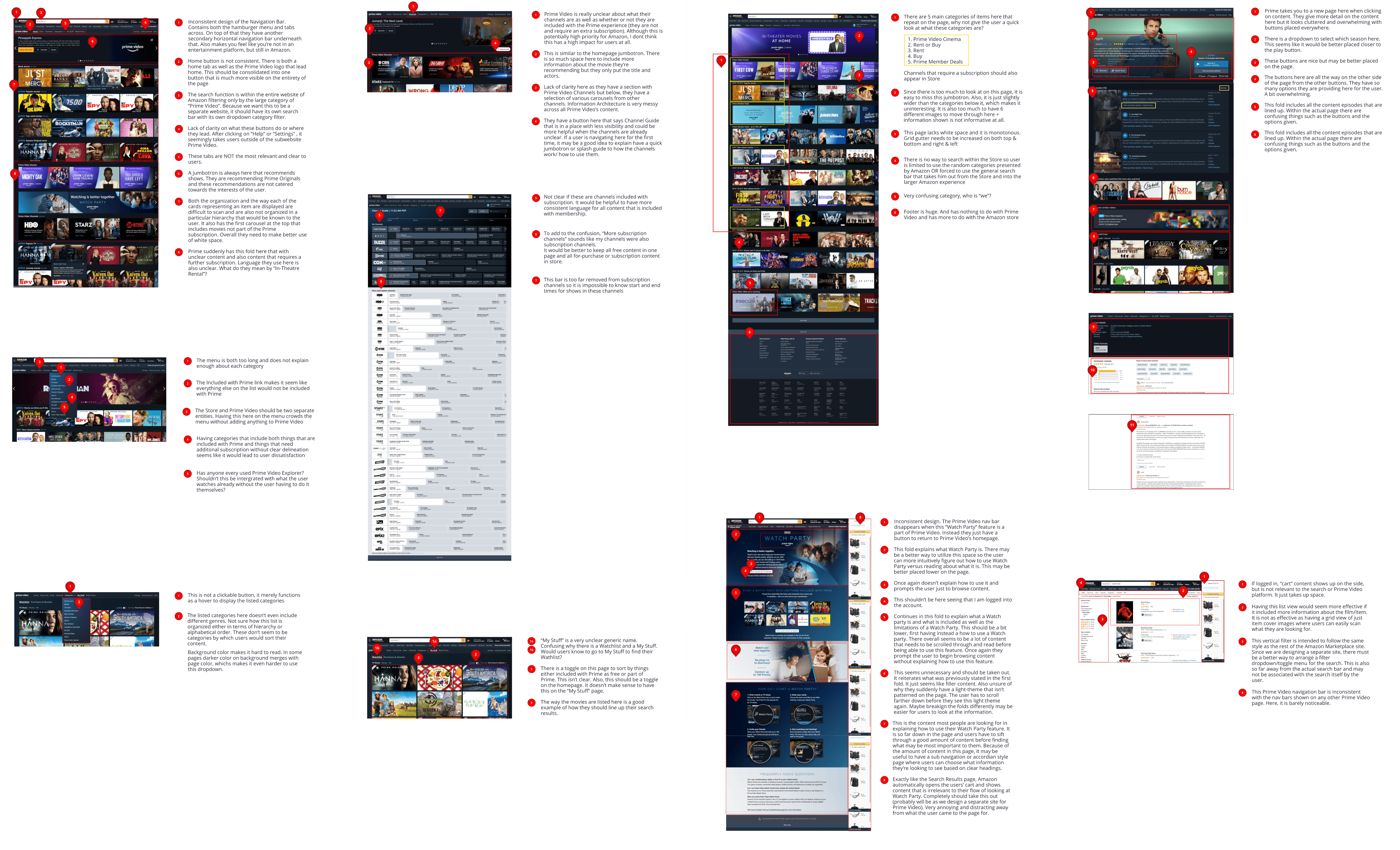
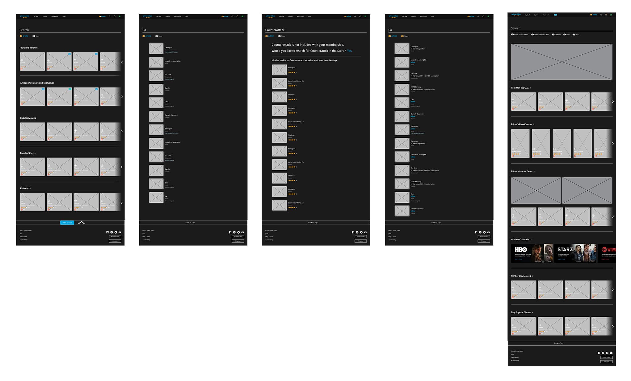
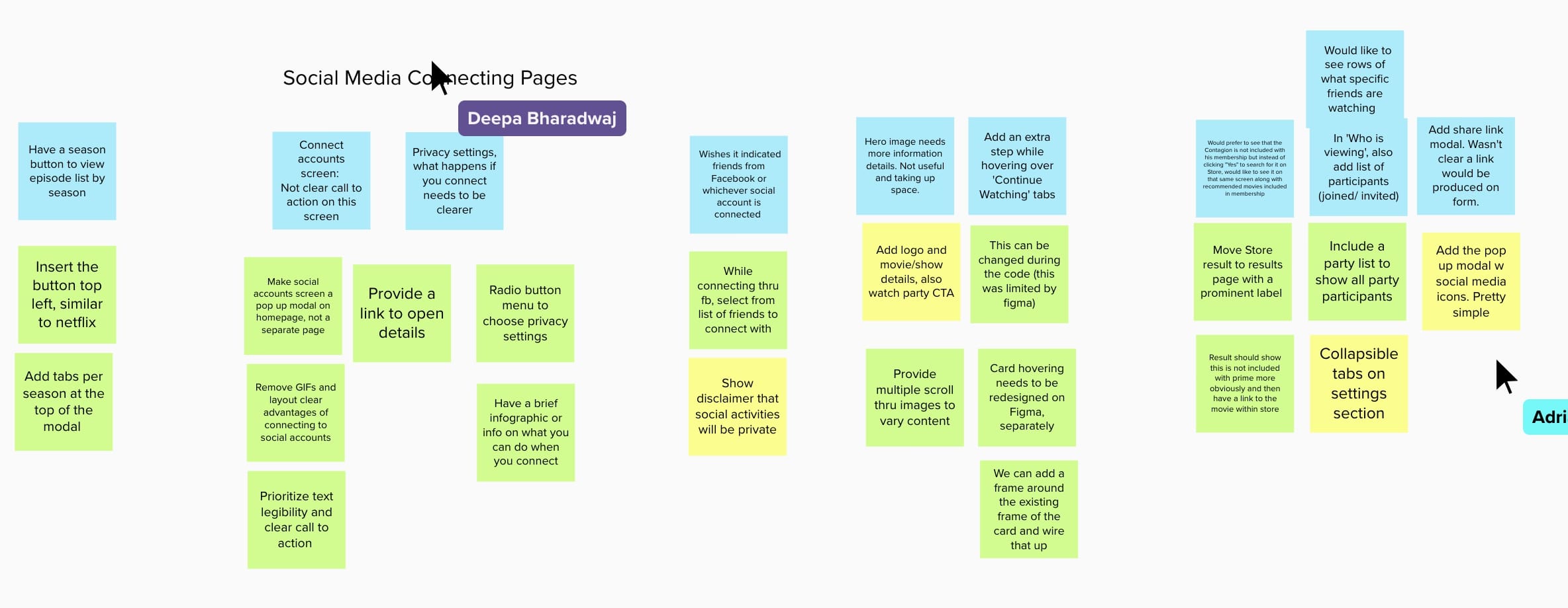
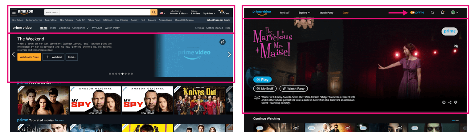
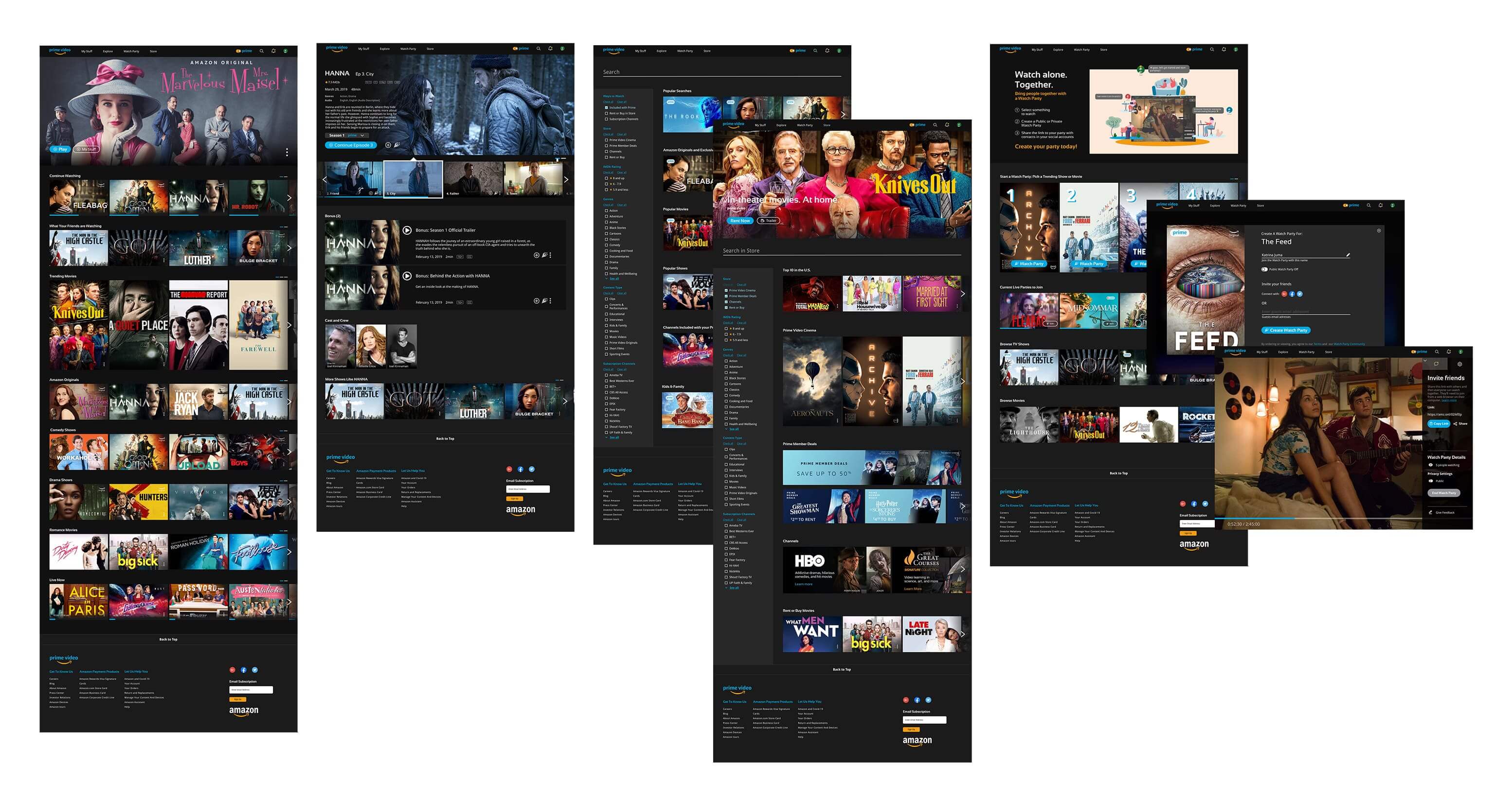
We began with a page-by-page heuristic analysis of Prime Video — homepage, show/movie detail, search, store, and the Watch Party page that users had flagged as most desirable.
Page-by-page audit of usability issues
FIG.04
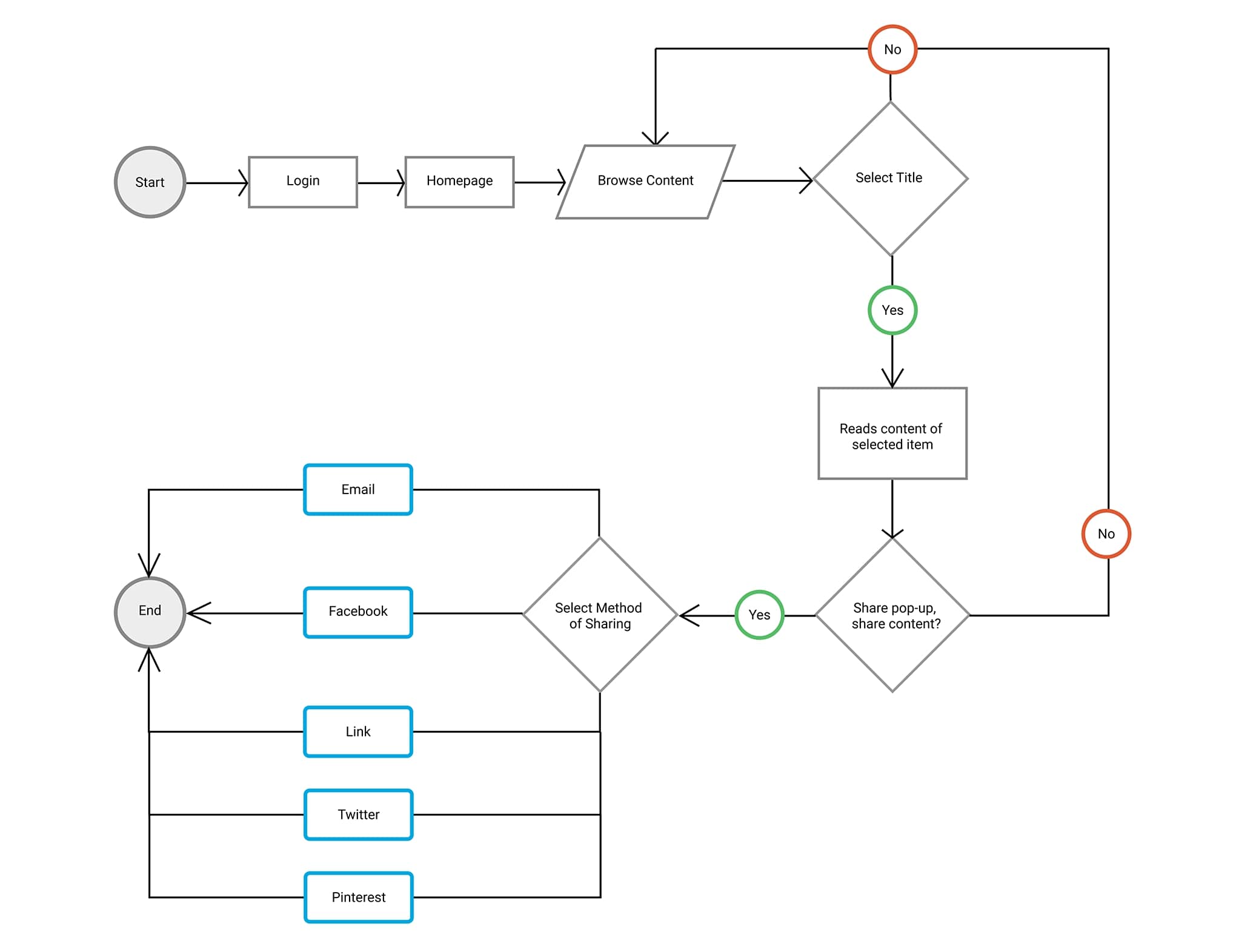
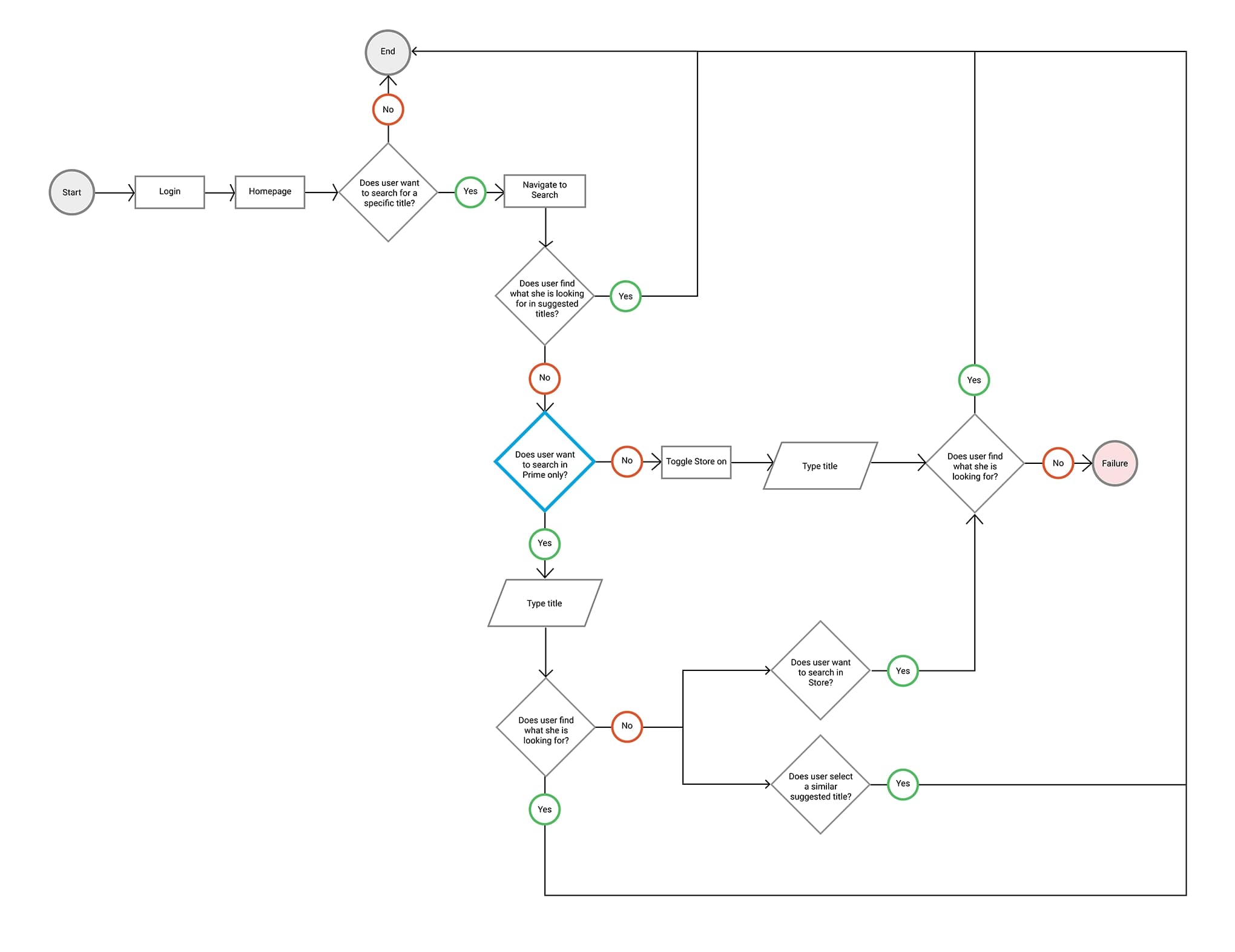
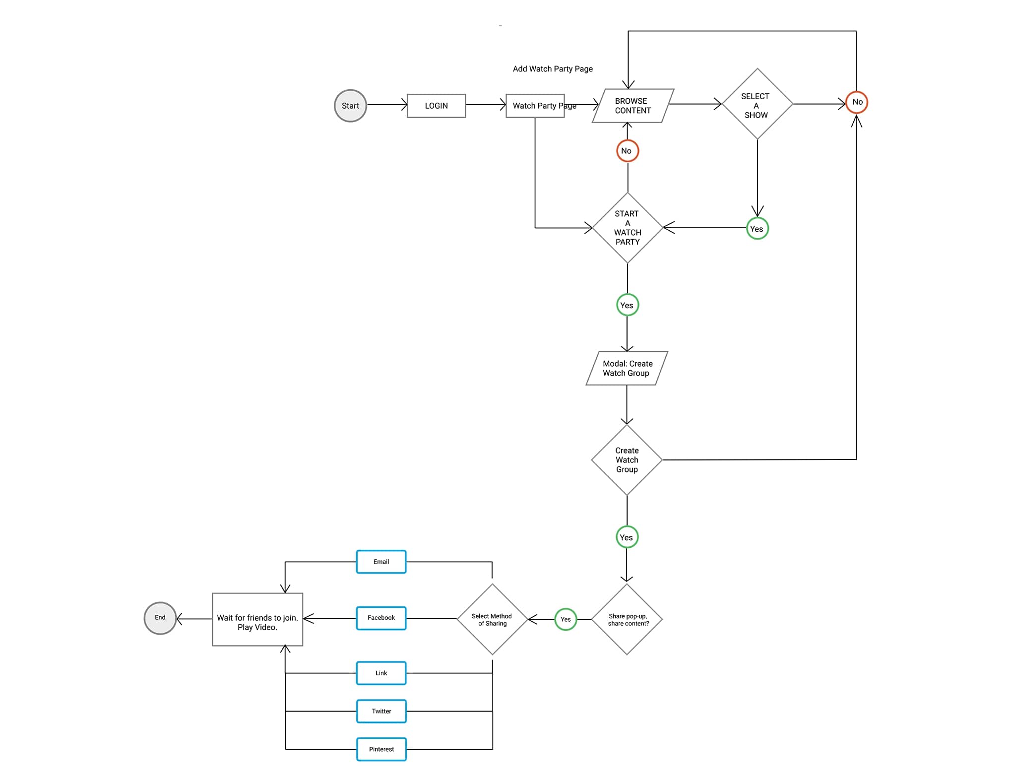
User flows
Given the ambitious goals, we mapped flows for the high-stakes paths so we could test each one independently:
- Login and connect to social accounts
- Browse content on the homepage
- Search for content
- Explore the Store
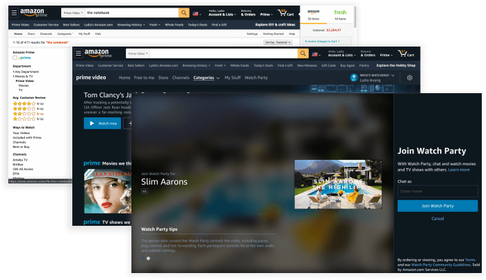
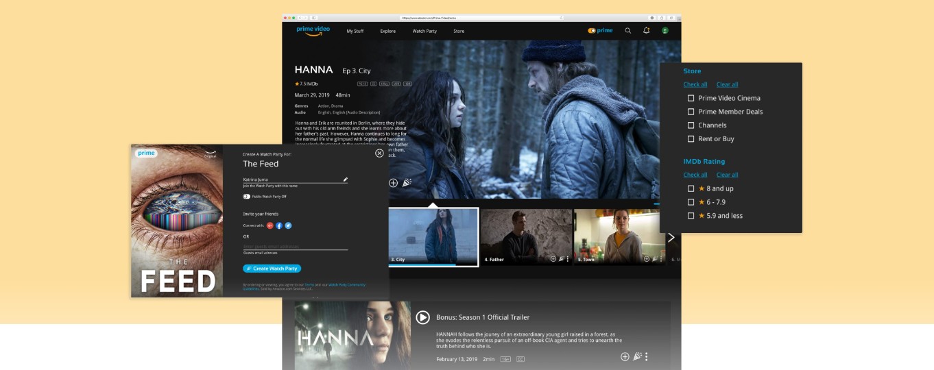
- Create and start a Watch Party
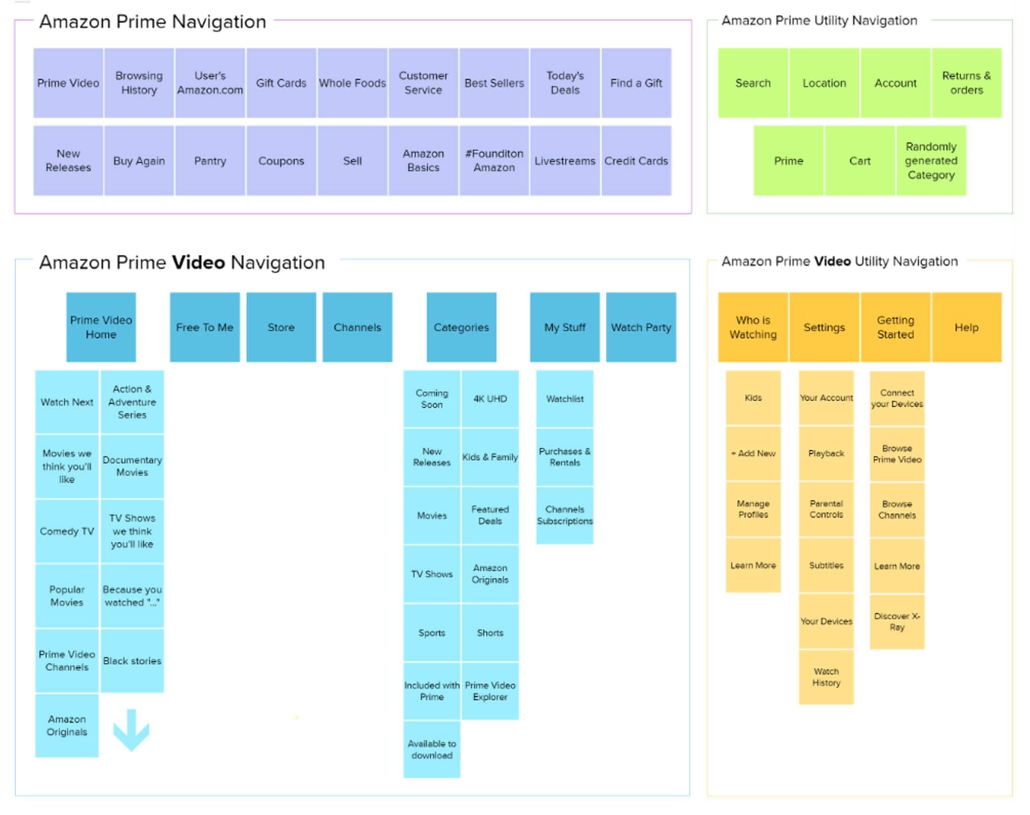
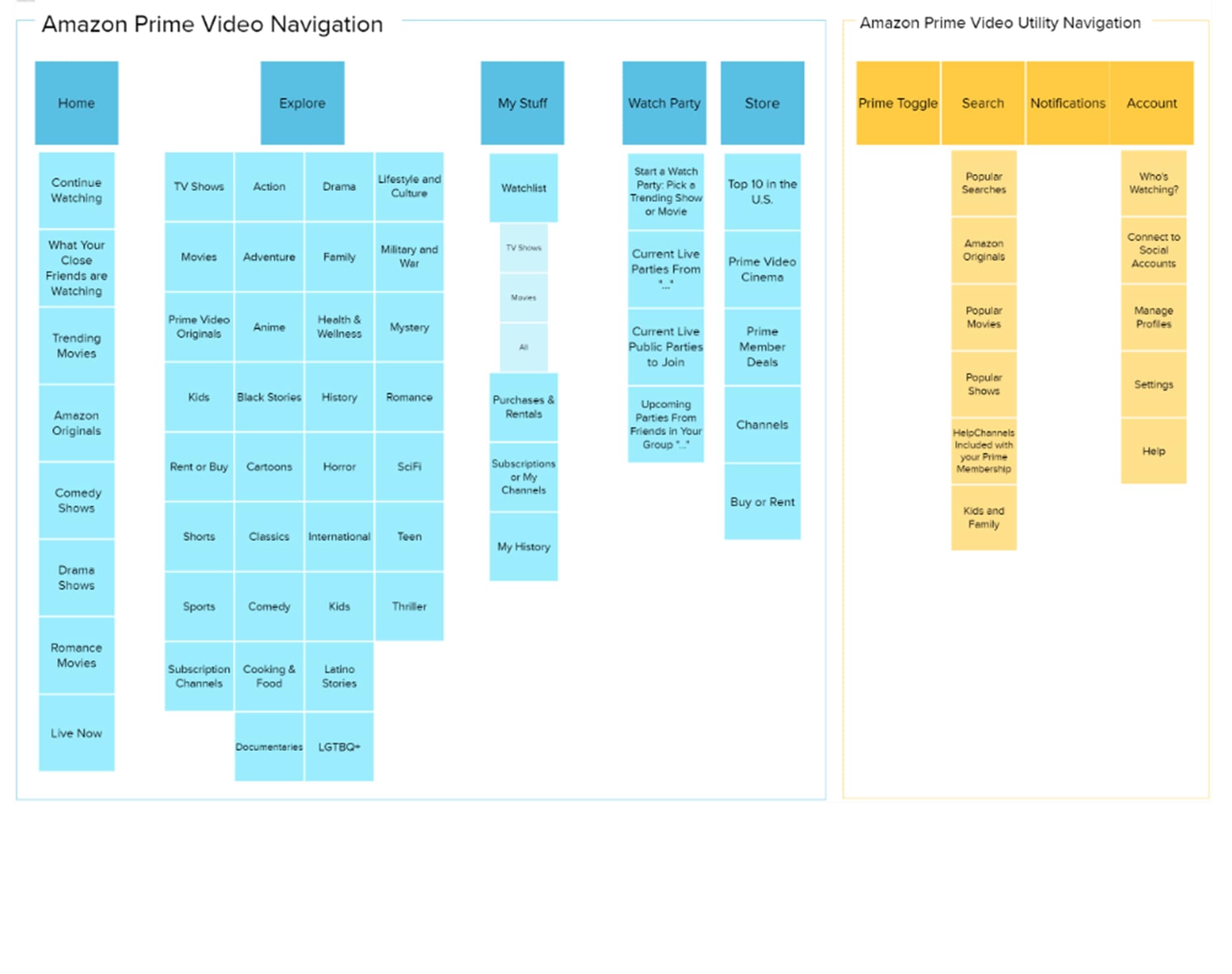
Information architecture
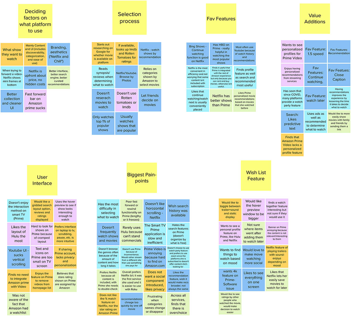
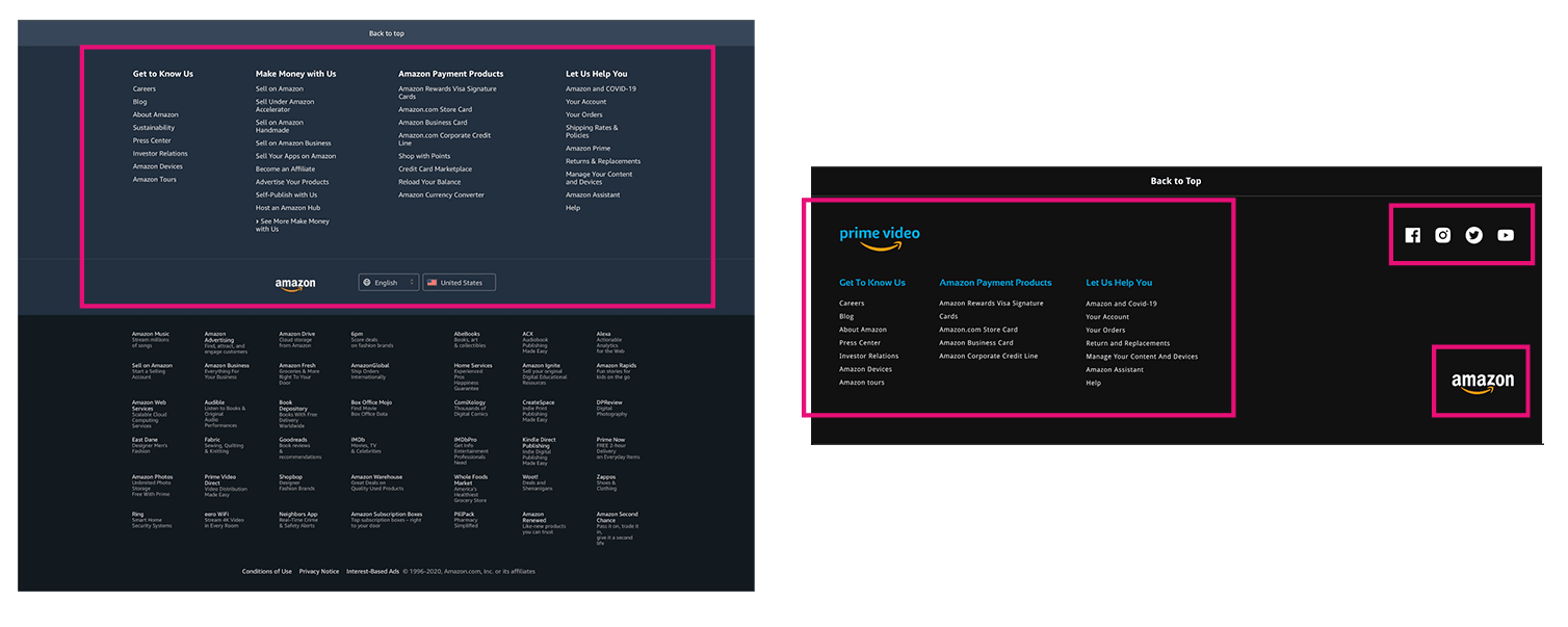
One of the site's loudest issues was the display of irrelevant information. We ran a card-sorting exercise to redefine the IA — the redesigned sitemap is dramatically more streamlined and intuitive than the original.
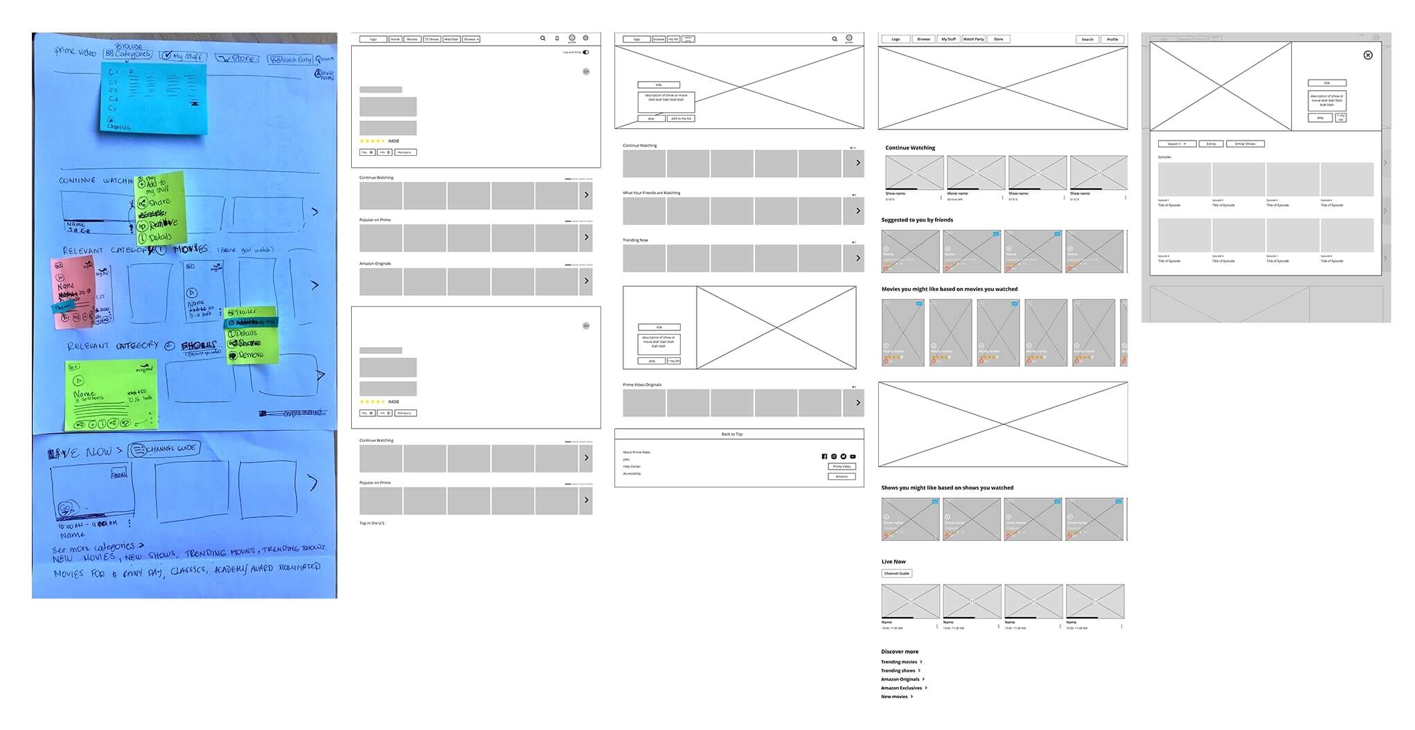
Wireframes & visual system
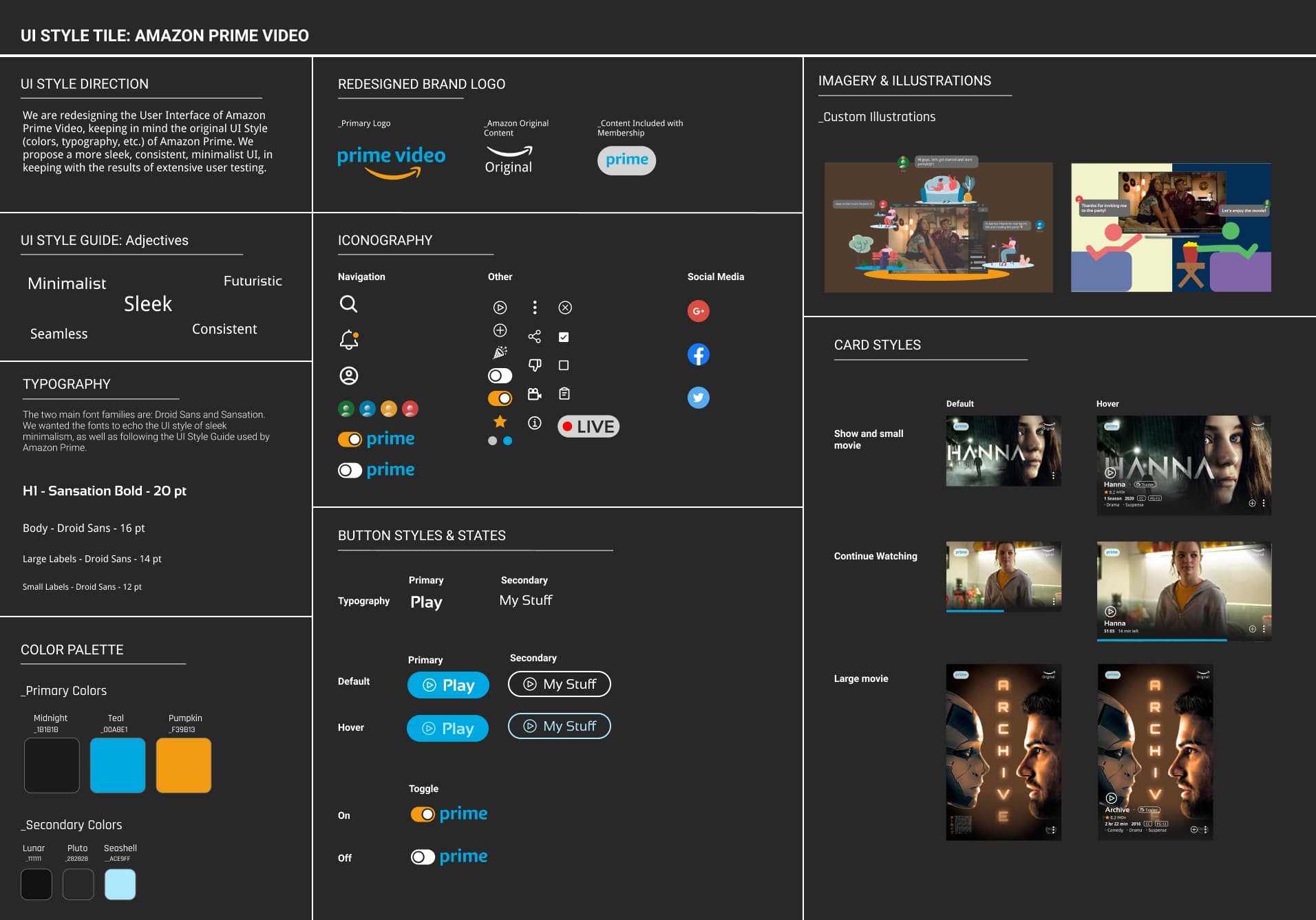
From there: low-fi wireframes to lay out user-preferred content and to ideate iconography and interactions. Then a style tile referencing Amazon Prime's existing UI guide so the redesign felt familiar — not foreign.
I led the UI redesign objectives and visual style consolidation, and built out a UI component library — atom elements first (text, color, icon components), then nested compounds. Consistent naming made instance swapping painless across the team.
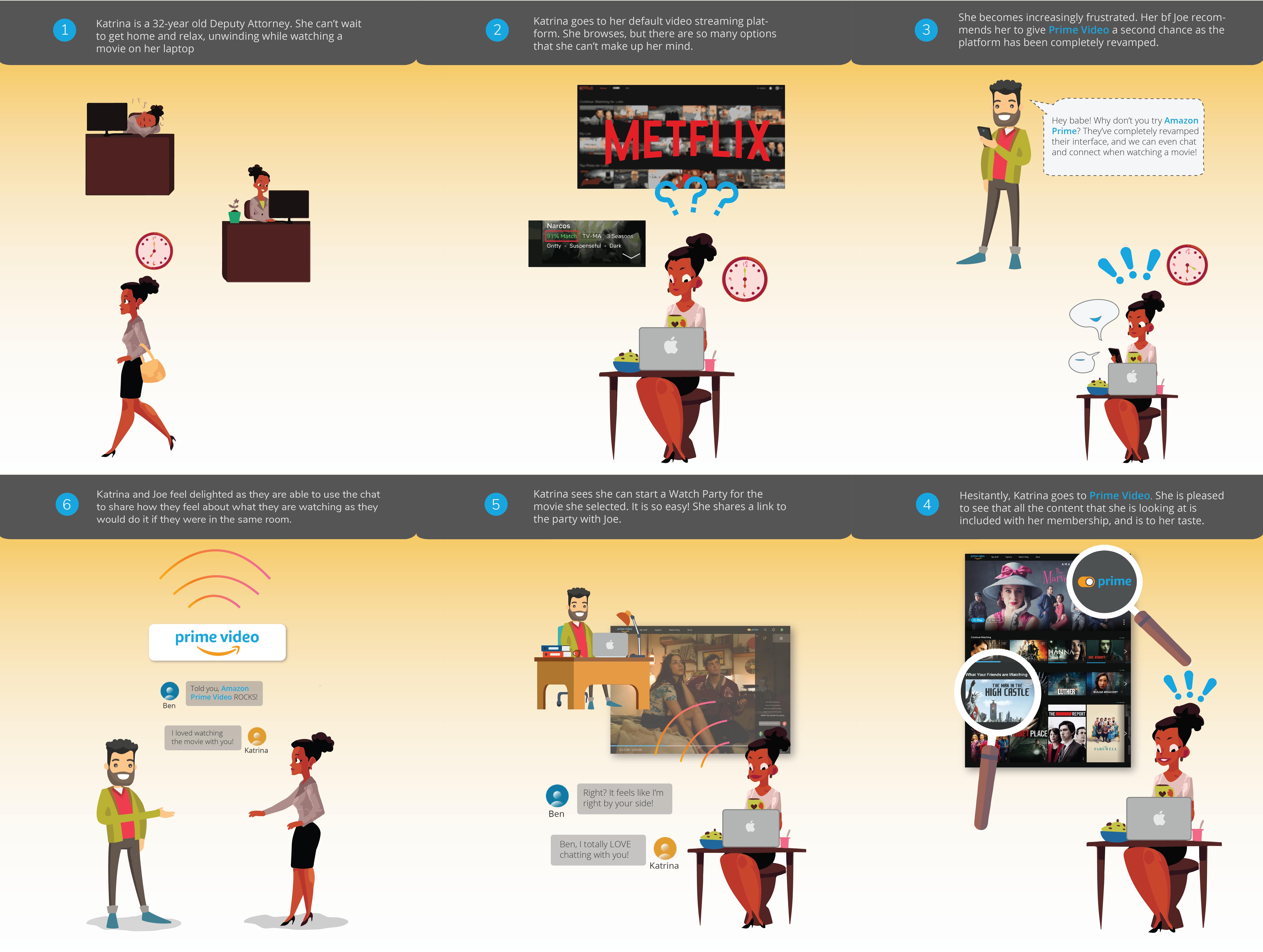
 [ FIG.01 ]
PRIME VIDEO · REDESIGN
UC BERKELEY EXT · 2020
4 WEEKS · 5 DESIGNERS
[ FIG.01 ]
PRIME VIDEO · REDESIGN
UC BERKELEY EXT · 2020
4 WEEKS · 5 DESIGNERS